|
|
|
Components of the Rave DesignerThe previous section discussed the Rave components available in Delphi, because when you use this reporting engine you'll do most of your work in the report designer. The core element of a report (available at the top of the Project Tree view) is the RaveProject component, also called the Project Manager. This is not a component you drop on a report, because there is always only one object of this type in every report (as there is one global Application object in a Delphi program). The RaveProject component is the owner of all the other report components. Like every component in Rave, the Project Manager has properties. To see them, select RaveProject in the Project Tree, and then look in the Property panel. To create a new RaveProject, click the New Project button on the Project toolbar. Doing so will create a new file, as well as the new Project Manager. Every project can host multiple reports, represented by the Report component. A Report component contains the pages of a report. There can be multiple Reports in one project, and each Report can have multiple Pages. The Page component is the base visual component upon which you can place the report's visual components. You complete the designing and layout of a report here. In addition to the list of reports available under the Report Library node, a Rave project has a Global Page Catalog, introduced earlier, and a Data View Dictionary. The Data View Dictionary is a detailed list of the data conduits made available by the hosting Delphi application (using the Delphi Rave connection components covered earlier) or activated directly from the report to a database. You design the report by placing visual components directly on the page or on another container, such as a Band or a Region. Some of these components are not connected with database data—for example, the Text, Memo, and Bitmap components in the designer's Standard toolbar. Other components can be connected with a field in a database table (or are data-aware, to use a Delphi term), such as the DataText and DataMemo components on the Report toolbar. Basic ComponentsThe Standard toolbar contains seven components: Text, Memo, Section, Bitmap, Metafile, FontMaster, and PageNumInit. Many of the standard components are used frequently when designing reports. Text and Memo ComponentsThe Text component is useful for displaying a single line of text on the report. It acts like a label that can contain simple text (not data). When placed on the report, the Text box is surrounded by a box that indicates its boundaries. Memo components are similar to Text components, but they can contain multiple lines of text. When you set the Memo's font, all text in the Memo will have the same font, as in a Delphi Memo component. Once you've entered the text, the Memo box can be resized, and the text within the Memo box will be repositioned accordingly. If text seems to missing from the Memo box after it has been entered in the Memo Editor, resize the box to allow all text to be visible. The Section ComponentThe Section component is used to group components, like a Panel in Delphi. It provides advantages such as letting you move all components that form part of the Section with one mouse click, as opposed to making you move each component individually or try to select all components before moving. The Project Tree is helpful when you're dealing with the Section component. From an expanded node, it is easy to see what components are in each Section, because compound components can form a tree with parent-child relationships.
Graphical ComponentsThe Bitmap and Metafile components let you place images in a report. Bitmap supports raster image files with the extension .bmp, and Metafile supports vector image files with the extensions .wmf and .emf. Metafiles are not supported when you use Rave in a CLX application, because they are based on a specific Windows technology. The FontMaster ComponentEach Text component in a report has a Font property. By setting this property, you can assign a specific font to the component. In many cases, it may be useful and necessary to set the same font properties for more than one object. Although you can do so by selecting more than one component at a time, this method has a drawback: You have to keep track of which fonts must be the same typeface, size, and style, which is not an easy task for more than one report. The FontMaster component lets you define standard fonts for different parts of the report, such as the headers, body, and footers. The FontMaster is a non-visual component (designated by the button's green color), so there will be no visual reference to it on the page (unlike in Delphi); and, like other non-visual components, it can only be accessed using the Project Tree. Once you've set the FontMaster component's Font property, linking it to a body of text is simple. On the report, select a Text/Memo component, and then use the down arrow button by the FontMirror property in the Property panel to choose a FontMaster link. Any component whose FontMirror property is set to the FontMaster will be affected by and changed to the FontMaster's Font property. When you set a component's FontMirror property, the component's Font property will be overridden by the FontMaster's Font property. Another side effect of using the FontMaster is that the Font toolbar is disabled when the FontMirror property is set for that component. There can be more than one FontMaster per page; however, it is good practice to rename FontMaster components to describe their function. You should also locate them on a Global Page, so they can be used by all reports within the project and provide a more consistent typographical layout. Page NumbersPageNumInit is a non-visual component that lets you restart page numbering within a Report. Its use is similar to that of other non-visual components. You use PageNumInit when more advanced formatting is required. For example, consider a customer statement report for a checking account. The account statements customers receive every month may vary in the number of pages. Suppose the first page defines the account summary page layout, the second defines the customer's credits/deposits, and the third defines withdrawals and debits. The first two reports may need only one page; but if account activity is high for a customer, then the withdrawals section may be several pages long. If the user producing the report wants each section's pages numbered individually, the summary and deposits pages should both be marked "1 of 1". If an active customer account has three pages of withdrawals and debits, this section of the statement should be numbered "1 of 3", "2 of 3", and "3 of 3". PageNumInit comes in handy for this kind of page numbering. Drawing ComponentsLike the standard components, drawing components aren't related to data. Rave reports can include three components for lines: Generic lines are drawn in any direction and include angled lines; horizontal and vertical lines have a fixed direction. Available geometric shapes include squares, rectangles, circles, and ellipses. You can drop a shape on a report and then move it behind another element. For example, you can place a rectangle around a DataBand, set it so that it is sized to completely fill the band, and then move it behind the other components placed in the band. Bar Code ComponentsBar code components are used to create many different kinds of bar codes in a report. Bar codes are for users who know exactly what they need, you must have background knowledge about bar codes and how they are used. To define a bar code value, go to the Property panel and type the value in the Text property box. Rave bar codes support includes the following:
Data Access ObjectsIn most cases, a report will be based on a data feed, either directly from a database or from a Delphi application. The data might come from a dataset connected to a database or from some internal processing of a Delphi program. When you choose the New Data Object button on the Project toolbar, you'll see the alternatives shown here and described in the following list: 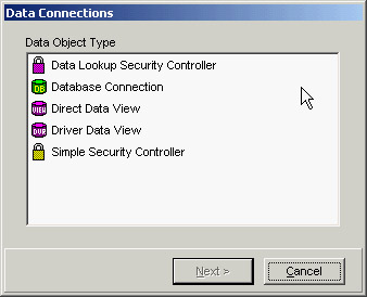
Regions and BandsA Region component is a container for Band components. In its simplest form, the Region could be the whole Page component. This would be true for a report that is a list type. Many master-detail reports could be made to fit a single-Region design. However, do not be limited by thinking of a Region as being the entire Page; the properties for a Region deal with its size and location on the Page. Creative use of Regions will give you more flexibility when you're designing complex reports. Multiple Regions can be placed on a single Page; they can be side-by-side, one above the other, or staggered about the Page.
When you're working with Bands, you must follow a simple rule: Bands must be in a Region. Notice that the number of Regions on a Page is not limited, nor is the number of Bands within a Region. As long as you can visualize the report mentally, you can use a combination of Regions and Bands to solve any difficulties faced when putting those thoughts into design. There are two band types:
ControllerBand is an important property for the Band component. This property determines which DataBand a Band belongs to (or is controlled by). When the controlling DataBand has been set, notice that the graphics symbol on the Band points in the direction of that controlling Band and that the color of the symbols matches. The letter codes shown on the Band are explained in the following section, "The Band Style Editor." The Band Style EditorGo to the BandStyle property of a Band or DataBand component and click the ellipsis button to open the Band Style Editor: 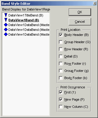 This editor provides a simple method to select the features you want for a Band by using the check boxes. Note that a Band can have several different features active at a time. This means it is possible for a Band to be both a Body Header and Body Footer simultaneously. The display area in the Band Style Editor is designed to represent the flow of a report in pseudo-layout style. DataBands are duplicated three times to show that they are repeated. The current Band that is being edited is highlighted: Although you see the other Bands in the editor, you can only modify the settings of the current one. The Band Style Editor uses symbols and letters in the display area and in the Page Layout area (for example, see Figure 18.6) to inform you about each Band's behavior. The major difference between these two representations is that the Band Style Editor display arranges the bands in a pseudo flow according to the definition of each Band. In the Band Style Editor the Bands are arranged according to the logical flow and the order they are placed in the report at design time. The Bands sequence in the report's output is mainly controlled by this order. Headers (capital letters BGR, which stand for Body, Group, and Row, respectively) will print first, followed by the DataBand, and then the footers (lower case letters bgr) for each level. However, if more than one header is defined for a particular level, then the header Bands are processed in the order they are arranged in the Region. So, it is possible to put all the headers at the top, all the DataBands in the middle, and all the footers at the bottom of a Region for all levels of a master-detail report. Alternatively, you can group each level, with the appropriate headers, footers, and DataBands together for each level. Rave lets you use the Region layout in a way that makes the most sense to the design flow. Just remember that the order of precedence for Bands at the same level is controlled by their order within the Region. Two symbols show the parent/child or master/detail relationships of the various bands:
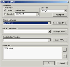
These symbols are both color-coded and indented to represent the level of master-detail flow. Remember that you can have a master/detail/detail relationship in which both details are both controlled by the same master or one of the details is controlled by the other detail. Data-Aware ComponentsYou can place different data-aware Rave components within a DataBand. The most common choice is the DataText component, used to display a text field from a dataset, as you saw in the RaveSingle example. Two options are available for entering data in a DataField property. The first is to select a single field using the drop-down list; this approach is fine for normal database reporting where only a single data field for each DataText item may be needed. The second is to use the Data Text Editor. The Data Text EditorMany reports require various fields to be combined. Two common examples are city, state, and zip code, or first name and last name combinations. In code, you can accomplish these combinations using statements like the following: City + ', ' + State + ' ' + Zip FirstName & LastName The DataField property has a Data Text Editor, shown in Figure 18.5, which assists you in building composite fields. Click on the ellipsis to open the DataText Editor; it gives you the power to concatenate fields, parameters, or variables to build a complex data-aware text field by selecting items from the list boxes. This editor includes a lot of combinations; I will cover them quickly here, and you can try them in practice. Note that the dialog box is divided into five groups: Data Fields, Report Variables, Project Parameters, Post Initialize Variables, and Data Text. Data Text is the result window: Watch this window when you're inserting items. The two buttons on the right side of this window are plus (+) and ampersand (&). The + button adds two items together with no spaces, and the & button concatenates them with a single space (as long as the previous field was not blank). So, the first step is to decide whether you want to use + or &, and then select the text from one of the three groups above the Data Text window. The DataText component is not limited to printing database data: You can also use project parameters and report variables. Go to the Report Variables group, look in the list box, note the variables that are available. The Project Parameters list could contain UserName, ReportTitle, or UserOption parameters initialized by the application. To create the list of project parameters, select the Project node in the Project Tree (the top item). Then, in the Properties panel, click the ellipsis button by the Parameters property to open typical string editor, where you can enter the different parameters you want to pass to Rave from the application (such as the UserName). From Text to MemoThe DataMemo component displays a memo field from a DataView. The main difference between the DataMemo component and the DataText component is that the DataMemo component is used to print text that may require more than one line and will thus need to be wrapped. For example, it could be used to print remarks about a customer at the bottom of each Page of an invoice. One use for the DataMemo component is mail-merge functions. The easiest way to accomplish this is to set the DataView and DataField properties to the source of the Memo field. Then, launch the Mail Merge Editor by clicking the ellipsis button by the MailMergeItems property. This editor lets you set the items in the Memo that will be changed. To use the Mail Merge Editor, click the Add button. In the Search Token window, type the item that is in the Memo and that will be replaced. Then, either type the replacement string in the Replacement window or click the Edit button to start the Data Text Editor that will help you select different DataViews and fields. Calculating TotalsThe CalcText component is a data-aware totaling component. The main difference between the DataText component and the CalcText component is that the CalcText component is specially designed to perform calculations and display the results. The CalcType property determines the type of calculation being performed; values include Average, Count, Maximum, Minimum, and Sum. For example, you can use this component to print the totals of an invoice at the top of each page. The CountBlanks property determines whether blank field values are included in the Average and Count calculation methods. If RunningTotal is True, then the calculation will not be reset to 0 each time it is printed. Cycling on Data inside PagesThe DataCycle component is basically an invisible DataBand that adds data-iterating capabilities directly to a Page. This component is useful for form-style reports where using Regions and Band components would be cumbersome. It is important to make sure the DataCycle component appears before any components on the Page that process information from the same DataView.
|
|
|||||||||||||||||||||||||||||||||||||||||||||||||||||||||||||||||||||||||||||||||||||||||||||||||||||||||||||||||||||||||||||||||||||||||||||||||||||||||||||||||||||||||||||||||||||||||||
|