|
|
|
A Complex Graphical ComponentIn this section, I'll demonstrate how to build a graphical Arrow component. You can use such a component to indicate a flow of information or an action. This component is quite complex, so I'll show you the various steps instead of looking directly at the complete source code. The component I've added to the MdPack package is the final version of this process, which demonstrates several important concepts:
Defining an Enumerated PropertyAfter generating the new component with the Component Wizard and choosing TGraphicControl as the parent class, you can begin to customize the component. The arrow can point in any of four directions: up, down, left, or right. An enumerated type expresses these choices: type TMdArrowDir = (adUp, adRight, adDown, adLeft); This enumerated type defines a private data member of the component, a parameter of the procedure used to change it, and the type of the corresponding property. The ArrowHeight property determines the size of the arrowhead, and the Filled property specifies whether to fill the arrowhead with color:
type
  TMdArrow = class (TGraphicControl)
  private
    FDirection: TMdArrowDir;
    FArrowHeight: Integer;
    FFilled: Boolean;
    procedure SetDirection (Value: TMd4ArrowDir);
    procedure SetArrowHeight (Value: Integer);
    procedure SetFilled (Value: Boolean);
  published
    property Width default 50;
    property Height default 20;
    property Direction: TMd4ArrowDir
      read FDirection write SetDirection default adRight;
    property ArrowHeight: Integer
      read FArrowHeight write SetArrowHeight default 10;
    property Filled: Boolean read FFilled write SetFilled default False;
The three custom properties are read directly from the corresponding field and are written using three Set methods, all having the same standard structure:
procedure TMdArrow.SetDirection (Value: TMdArrowDir);
begin
  if FDirection <> Value then
  begin
    FDirection := Value;
    ComputePoints;
    Invalidate;
  end;
end;
Notice that you ask the system to repaint the component (by calling Invalidate) only if the property is really changing its value and after calling the ComputePoints method, which computes the triangle delimiting the arrowhead. Otherwise, the code is skipped and the method ends immediately. This code structure is common, and you will use it for most of the Set procedures of properties. You must also remember to set the properties' default values in the component's constructor: constructor TMdArrow.Create (AOwner: TComponent); begin // call the parent constructor inherited Create (AOwner); // set the default values FDirection := adRight; Width := 50; Height := 20; FArrowHeight := 10; FFilled := False; As mentioned before, the default value specified in the property declaration is used only to determine whether to save the property's value to disk. The Create constructor is defined in the public section of the new component's type definition, and the constructor is marked by the override keyword, as it replaces the virtual Create constructor of TComponent. It is fundamental to remember the override specifier; otherwise, when Delphi creates a new component of this class, it will call the base class's constructor, rather than the one you've written for your derived class.
In the definition of the Arrow component, notice the use of several naming conventions for properties, access methods, and fields. Here is a summary:
These are just guidelines to make your programs more readable. The compiler doesn't enforce them. These conventions are described in the Delphi Component Writers' Guide and are followed by Delphi's class completion mechanism.
Writing the Paint MethodDrawing the arrow in the various directions and with the various styles requires a fair amount of code. To perform custom painting, you override the Paint method and use the protected Canvas property. Instead of computing the position of the arrowhead points in drawing code that will be executed often, I've written a separate function to compute the arrowhead area and store it in an array of points defined among the private fields of the component: FArrowPoints: array [0..3] of TPoint; These points are determined by the ComputePoints private method, which is called every time a component property changes. Here is an excerpt of its code:
procedure TMdArrow.ComputePoints;
var
  XCenter, YCenter: Integer;
begin
  // compute the points of the arrowhead
  YCenter := (Height - 1) div 2;
  XCenter := (Width - 1) div 2;
  case FDirection of
    adUp: begin
      FArrowPoints [0] := Point (0, FArrowHeight);
      FArrowPoints [1] := Point (XCenter, 0);
      FArrowPoints [2] := Point (Width-1, FArrowHeight);
    end;
  // and so on for the other directions
The code computes the center of the component area (dividing the Height and Width properties by two) and then uses the center to determine the position of the arrowhead. In addition to changing the direction or other properties, you need to refresh the position of the arrowhead when the size of the component changes. You can override the SetBounds method of the component, which is called by VCL every time the Left, Top, Width, and Height properties of a component change: procedure TMdArrow.SetBounds(ALeft, ATop, AWidth, AHeight: Integer); begin inherited SetBounds (ALeft, ATop, AWidth, AHeight); ComputePoints; end; Once the component knows the position of the arrowhead, its painting code becomes simpler. Here is an excerpt of the Paint method:
procedure TMdArrow.Paint;
var
  XCenter, YCenter: Integer;
begin
  // compute the center
  YCenter := (Height - 1) div 2;
  XCenter := (Width - 1) div 2;

  // draw the arrow line
  case FDirection of
    adUp: begin
      Canvas.MoveTo (XCenter, Height-1);
      Canvas.LineTo (XCenter, FArrowHeight);
    end;
    // and so on for the other directions
  end;

  // draw the arrow point, eventually filling it
  if FFilled then
    Canvas.Polygon (FArrowPoints)
  else
    Canvas.PolyLine (FArrowPoints);
end;
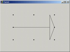
You can see an example of the output of this component in Figure 9.6. Adding TPersistent PropertiesTo make the output of the component more flexible, I've added to it two new properties, Pen and Brush, defined with a class type (a TPersistent data type, which defines objects that Delphi can automatically stream). These properties are a little more complex to handle, because the component now has to create and destroy these internal objects. This time, however, you also export the internal objects using properties, so that users can directly change these internal objects from the Object Inspector. To update the component when these subobjects change, you'll also need to handle their internal OnChange property. Here is the definition of the Pen property and the other changes to the definition of the component class (the code for the Brush property is similar):
type
  TMdArrow = class (TGraphicControl)
  private
    FPen: TPen;
    ...
    procedure SetPen (Value: TPen);
    procedure RepaintRequest (Sender: TObject);
  published
    property Pen: TPen read FPen write SetPen;
  end;
You first create the object in the constructor and set its OnChange event handler: constructor TMdArrow.Create (AOwner: TComponent); begin ... // create the pen and the brush FPen := TPen.Create; // set a handler for the OnChange event FPen.OnChange := RepaintRequest; end; These OnChange events are fired when one of the properties of the pen changes; all you have to do is to ask the system to repaint your component: procedure TMdArrow.RepaintRequest (Sender: TObject); begin Invalidate; end; You must also add a destructor to the component, to remove the graphical object from memory (and free its system resources). All the destructor has to do is call the Pen object's Free method. A property related to persistent objects requires special handling: Instead of copying the pointer to the object, you have to copy the internal data of the object passed as a parameter. The standard := operation copies the pointer, so in this case you have to use the Assign method: procedureTMdArrow.SetPen (Value: TPen); begin FPen.Assign(Value); Invalidate; end; Many TPersistent classes have an Assign method you should use when you need to update the data of these objects. Now, to use the pen for the drawing, you must modify the Paint method, setting the corresponding property of the component Canvas to the value of the internal object before drawing a line (see the example of the component's new output in Figure 9.7): procedure TMdArrow.Paint; begin // use the current pen Canvas.Pen := FPen; As the Canvas uses a setter routine to Assign the pen object, you're not simply storing a reference to the pen in a field of the Canvas, but you are copying all of its data. This means that you can freely destroy the local Pen object (FPen) and that modifying FPen won't affect the canvas until Paint is called and the code above is executed again. Defining a Custom EventTo complete the development of the Arrow component, let's add a custom event. Most of the time, new components use the events of their parent classes. For example, in this component, I've made some standard events available by redeclaring them in the published section of the class:
type
  TMdArrow = class (TGraphicControl)
  published
    property OnClick;
    property OnDragDrop;
    property OnDragOver;
    property OnEndDrag;
Thanks to this declaration, the events (originally declared in a parent class) will be available in the Object Inspector when the component is installed. Sometimes, however, a component requires a custom event. To define a new event, you first need to ensure that there is already a method pointer type suitable for use by the event; if not, you need to define a new event type. This type is a method pointer type (see Chapter 5, "Visual Controls," for details). In both cases, you need to add to the class a field of the event's type: here is the definition I've added in the private section of the TMdArrow class: FArrowDblClick: TNotifyEvent; I've used the TNotifyEvent type, which has only a Sender parameter and is used by Delphi for many events, including OnClick and OnDblClick events. Using this field I've defined a published property, with direct access to the field: property OnArrowDblClick: TNotifyEvent read FArrowDblClick write FArrowDblClick; (Notice again the standard naming convention, with event names starting with On.) The fArrowDblClick method pointer is activated (executing the corresponding function) inside the specific ArrowDblClick dynamic method. This happens only if an event handler has been specified in the program that uses the component:
procedure TMdArrow.ArrowDblClick;
begin
  if Assigned (FArrowDblClick) then
    FArrowDblClick (Self);
end;
Using Low-Level Windows API CallsThe fArrowDblClick method is defined in the protected section of the type definition to allow future descendant classes to both call and change it. Basically, this method is called by the handler of the
Once you have defined a region, you can use the PtInRegion API call to test whether the point where the double-click occurred is inside the region. The complete source code for this procedure is as follows:
procedure TMdArrow.WMLButtonDblClk (
  var Msg: TWMLButtonDblClk); // message wm_LButtonDblClk;
var
  HRegion: HRgn;
begin
  // perform default handling
  inherited;

  // compute the arrowhead region
  HRegion := CreatePolygonRgn (FArrowPoints, 3, WINDING);
  try  // check whether the click took place in the region
    if PtInRegion (HRegion, Msg.XPos, Msg.YPos) then
      ArrowDblClick;
  finally
    DeleteObject (HRegion);
  end;
end;
The CLX Version: Calling Qt Native FunctionsThe previous code won't be portable to Linux and makes no sense for the CLX/Qt version of the component. If you want to build a similar component for the CLX class library, you can replace the Win32 API calls with direct (low-level) calls to the Qt layer, creating an object of the QRegion class, as in the following listing:
procedure TMdArrow.DblClick;
var
  HRegion: QRegionH;
  MousePoint: TPoint;
begin
  // perform default handling
  inherited;
  // compute the arrow head region
  HRegion := QRegion_create (PPointArray(FArrowPoints), True);
  try
    // get the current mouse position
    GetCursorPos (MousePoint);
    MousePoint := ScreenToClient(MousePoint);
    // check whether the click took place in the region
    if QRegion_contains(HRegion, PPoint(@MousePoint)) then
      ArrowDblClick;
  finally
    QRegion_destroy(HRegion);
  end;
end;
Registering Property CategoriesYou've added to this component some custom properties and a new event. If you arrange the properties in the Object Inspector by category, all the new elements will appear in the generic Miscellaneous category. Of course, this is far from ideal, but you can easily register the new properties in one of the available categories. You can register a property (or an event) in a category by calling one of the four overloaded versions of the RegisterPropertyInCategory function, defined in the DesignIntf unit. When calling this function, you indicate the name of the category, and you can specify the property name, its type, or the property name and the component it belongs to. For example, you can add the following lines to the Register procedure of the unit to register the OnArrowDblClick event in the Input category and the Filled property in the Visual category:
uses
  DesignIntf;

procedure Register;
begin
  RegisterPropertyInCategory ('Input', TMdArrow, 'OnArrowDblClick');
  RegisterPropertyInCategory ('Visual', TMdArrow, 'Filled');
end;
The first parameter is a string indicating the category name—a much simpler solution than the original Delphi 5 approach of using category classes. You can define a new category in a straightforward manner by passing its name as the first parameter of the RegisterPropertyInCategory function: RegisterPropertyInCategory ('Arrow', TMdArrow, 'Direction');
RegisterPropertyInCategory ('Arrow', TMdArrow, 'ArrowHeight');
Creating a new category for the specific properties of your component can make it much simpler for a user to locate its specific features. Notice, though, that because you rely on the DesignIntf unit, you should compile the unit containing these registrations in a design-time package, not a run-time package (the required DesignIde unit cannot be distributed). For this reason, I've written this code in a separate unit from the one defining the component and added the new unit (MdArrReg) to the package MdDesPk, including all the design-time-only units; this approach is discussed later, in the section "Installing the Property Editor."
Notice that my code registers the Filled property in two different categories. This is not a problem, because the same property can show up multiple times in the Object Inspector under different groups, as you can see in Figure 9.8. To test the arrow component, I've written the ArrowDemo program, which allows you to modify most of its properties at run time. This type of test is important after you have written a component or while you are writing it. 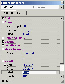
Figure 9.8: The Arrow component defines a custom property category, Arrow, as you can see in the Object Inspector. Notice that properties can be visible in multiple section, such as the Filled property in this case.
|
|
|||||||||||||||||||||||||||||||||||||||||||||||||||||||||||||||||||||||||||||||||||||||||||||||||||||||||||||||||||||||||||||||||||||||||||||||||||||||||||||||||||||||||||||||||||||||||||||||||||||||
|