|
|
|
Multiple-Page FormsWhen you need to display a lot of information and controls in a dialog box or a form, you can use multiple pages. The metaphor is that of a notebook: Using tabs, a user can select one of the possible pages. You can use two controls to build a multiple-page application in Delphi:
A third related class, the TabSheet, represents a single page of the PageControl. This is not a stand-alone component and is not available on the Component Palette. You create a TabSheet at design time by using the shortcut menu of the PageControl or at run time by using methods of the same control.
PageControls and TabSheetsAs usual, instead of duplicating the Help system's list of properties and methods for the PageControl component, I've built an example that stretches the control's capabilities and allows you to change its behavior at run time. The example, called Pages, has a PageControl with three pages. The structure of the PageControl and the other key components appears in Listing 6.1.
Listing 6.1: Key Portions of the DFM of the Pages Example
object Form1: TForm1
  BorderIcons = [biSystemMenu, biMinimize]
  BorderStyle = bsSingle
  Caption = 'Pages Test'
  OnCreate = FormCreate
  object PageControl1: TPageControl
    ActivePage = TabSheet1
    Align = alClient
    HotTrack = True
    Images = ImageList1
    MultiLine = True
    object TabSheet1: TTabSheet
      Caption = 'Pages'
      object Label3: TLabel
      object ListBox1: TListBox
    end
    object TabSheet2: TTabSheet
      Caption = 'Tabs Size'
      ImageIndex = 1
      object Label1: TLabel
      // other controls
    end
    object TabSheet3: TTabSheet
      Caption = 'Tabs Text'
      ImageIndex = 2
      object Memo1: TMemo
        Anchors = [akLeft, akTop, akRight, akBottom]
        OnChange = Memo1Change
      end
      object BitBtnChange: TBitBtn
        Anchors = [akTop, akRight]
        Caption = '&Change'
      end
    end
  end
  object BitBtnPrevious: TBitBtn
    Anchors = [akRight, akBottom]
    Caption = '&Previous'
    OnClick = BitBtnPreviousClick
  end
  object BitBtnNext: TBitBtn
    Anchors = [akRight, akBottom]
    Caption = '&Next'
    OnClick = BitBtnNextClick
  end
  object ImageList1: TImageList
    Bitmap = {...}
  end
end
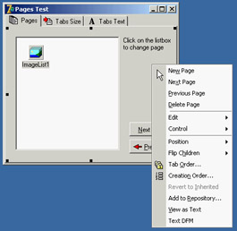
Notice that the tabs are connected to the bitmaps provided by an ImageList control and that some controls use the Anchors property to remain at a fixed distance from the right or bottom borders of the form. Even if the form doesn't support resizing (this would have been far too complex to set up with so many controls), the positions can change when the tabs are displayed on multiple lines (simply increase the length of the captions) or on the left side of the form. Each TabSheet object has its own Caption, which is displayed as the sheet's tab. At design time, you can use the shortcut menu to create new pages and to move between pages. You can see the shortcut menu of the PageControl component in Figure 6.1, together with the first page. This page holds a list box and a small caption, and it shares two buttons with the other pages. If you place a component on a page, it is available only in that page. How can you have the same component (in this case, two bitmap buttons) in each page, without duplicating it? Simply place the component on the form, outside the PageControl (or before aligning it to the client area), and then move it in front of the pages, calling the control ® Bring To Front command from the form's shortcut menu. The two buttons I've placed in each page can be used to move back and forth between the pages and are an alternative to using the tabs. Here is the code associated with one of them: procedure TForm1.BitBtnNextClick(Sender: TObject); begin PageControl1.SelectNextPage (True); end; The other button calls the same procedure, passing False as its parameter to select the previous page. Notice that there is no need to check whether you are on the first or last page, because the SelectNextPage method considers the last page to be the one before the first and will move you directly between those two pages. Now let's focus on the first page again. It has a list box, which at run time will hold the names of the tabs. If a user clicks an item in this list box, the current page changes. This is the third method available to change pages (after the tabs and the Next and Previous buttons). The list box is filled in the FormCreate method, which is associated with the OnCreate event of the form and copies the caption of each page (the Page property stores a list of TabSheet objects): for I := 0 to PageControl1.PageCount - 1 do ListBox1.Items.Add (PageControl1.Pages.Caption); When you click a list item, you can select the corresponding page: procedure TForm1.ListBox1Click(Sender: TObject); begin PageControl1.ActivePage := PageControl1.Pages [ListBox1.ItemIndex]; end; The second page hosts two edit boxes (connected with two UpDown components), two check boxes, and two radio buttons, as you can see in Figure 6.2. The user can input a number (or choose it by clicking the up or down buttons with the mouse or pressing the Up or Down arrow key while the corresponding edit box has the focus), check the boxes and the radio buttons, and then click the Apply button to make the changes: 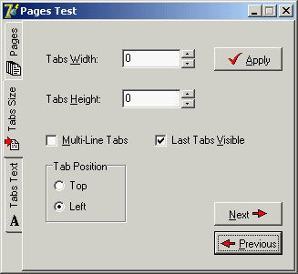
Figure 6.2: The second page of the example can be used to size and position the tabs. Here you can see the tabs on the left of the page control.
procedure TForm1.BitBtnApplyClick(Sender: TObject);
begin
  // set tab width, height, and lines
  PageControl1.TabWidth := StrToInt (EditWidth.Text);
  PageControl1.TabHeight := StrToInt (EditHeight.Text);
  PageControl1.MultiLine := CheckBoxMultiLine.Checked;
  // show or hide the last tab
  TabSheet3.TabVisible := CheckBoxVisible.Checked;
  // set the tab position
  if RadioButton1.Checked then
    PageControl1.TabPosition := tpTop
  else
    PageControl1.TabPosition := tpLeft;
end;
With this code, you can change the width and height of each tab (remember that 0 means the size is computed automatically from the space taken by each string). You can choose to have either multiple lines of tabs or two small arrows to scroll the tab area, and you can move the tabs to the left side of the window. The control also lets you place tabs on the bottom or on the right, but this program doesn't allow that, because it would make the placement of the other controls quite complex. You can also hide the last tab on the PageControl, which corresponds to the TabSheet3 component. If you hide one of the tabs by setting its TabVisible property to False, you cannot reach that tab by clicking on the Next and Previous buttons, which are based on the SelectNextPage method. Instead, you should use the FindNextPage function, which will select that page even if the tab won't become visible. A call of FindNextPage method is shown in the following new version of the Next button's OnClick event handler:
procedure TForm1.BitBtnNextClick(Sender: TObject);
begin
  PageControl1.ActivePage := PageControl1.FindNextPage (
    PageControl1.ActivePage, True, False);
end;
The last page has a memo component, again with the names of the pages (added in the FormCreate method). You can edit the names of the pages and click the Change button to change the text of the tabs, but only if the number of strings matches the number of tabs:
procedure TForm1.BitBtnChangeClick(Sender: TObject);
var
  I: Integer;
begin
  if Memo1.Lines.Count <> PageControl1.PageCount then
    MessageDlg ('One line per tab, please', mtError, [mbOK], 0)
  else
    for I := 0 to PageControl1.PageCount -1 do
      PageControl1.Pages [I].Caption := Memo1.Lines [I];
  BitBtnChange.Enabled := False;
end;
Finally, the last button, Add Page, allows you to add a new tab sheet to the page control, although the program doesn't add any components to it. The (empty) tab sheet object is created using the page control as its owner, but it won't work unless you also set the PageControl property. Before doing this, however, you should make the new tab sheet visible. Here is the code:
procedure TForm1.BitBtnAddClick(Sender: TObject);
var
  strCaption: string;
  NewTabSheet: TTabSheet;
begin
  strCaption := 'New Tab';
  if InputQuery ('New Tab', 'Tab Caption', strCaption) then
  begin
    // add a new empty page to the control
    NewTabSheet := TTabSheet.Create (PageControl1);
    NewTabSheet.Visible := True;
    NewTabSheet.Caption := strCaption;
    NewTabSheet.PageControl := PageControl1;
    PageControl1.ActivePage := NewTabSheet;
    // add it to both lists
    Memo1.Lines.Add (strCaption);
    ListBox1.Items.Add (strCaption);
  end;
end;
An Image Viewer with Owner-Draw TabsYou can also use the TabControl and a dynamic approach, as described in the last example, in more general (and simpler) cases. Every time you need multiple pages that all have the same type of content, instead of replicating the controls in each page, you can use a TabControl and change its contents when a new tab is selected. This is what I've done in the multiple-page bitmap viewer example, called BmpViewer. The image that appears in the TabControl of this form, aligned to the whole client area, depends on the selection in the tab above it (as you can see in Figure 6.3). 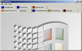
Figure 6.3: The interface of the bitmap viewer in the BmpViewer example. Notice the owner-draw tabs. At the beginning, the TabControl is empty. After selecting File ® Open, the user can choose various files in the File Open dialog box, and the array of strings with the names of the files (the Files property of the OpenDialog1 component) is added to the tabs (the Tabs property of TabControl1):
procedure TFormBmpViewer.Open1Click(Sender: TObject);
begin
  if OpenDialog1.Execute then
  begin
    TabControl1.Tabs.AddStrings (OpenDialog1.Files);
    TabControl1.TabIndex := 0;
    TabControl1Change (TabControl1);
  end;
end;
After you display the new tabs, you have to update the image so that it matches the first tab. To accomplish this, the program calls the method connected with the OnChange event of the TabControl, which loads the file corresponding to the current tab in the image component: procedure TFormBmpViewer.TabControl1Change(Sender: TObject); begin Image1.Picture.LoadFromFile (TabControl1.Tabs [TabControl1.TabIndex]); end; This example works, unless you select a file that doesn't contain a bitmap. The program will warn the user with a standard exception, ignore the file, and continue its execution. The program also lets you paste the bitmap on the Clipboard (without immediately getting it, but only adding a tab that will perform the actual paste operation when selected) and copy the current bitmap to it. Clipboard support is available in Delphi via the global Clipboard object defined in the ClipBrd unit. For copying or pasting bitmaps, you can use the Assign method of the TClipboard and TBitmap classes. When you select the Edit ® Paste command in the example, a new tab named Clipboard is added to the tab set (unless it is already present). Then the number of the new tab is used to change the active tab:
procedure TFormBmpViewer.Paste1Click(Sender: TObject);
var
  TabNum: Integer;
begin
  // try to locate the page
  TabNum := TabControl1.Tabs.IndexOf ('Clipboard');
  if TabNum < 0 then
    // create a new page for the Clipboard
    TabNum := TabControl1.Tabs.Add ('Clipboard');
  // go to the Clipboard page and force repaint
  TabControl1.TabIndex := TabNum;
  TabControl1Change (Self);
end;
The Edit ® Copy operation is as simple as copying the bitmap currently in the image Clipboard.Assign (Image1.Picture.Graphic); To account for the possible presence of the Clipboard tab, the code of the TabControl1Change method becomes:
procedure TFormBmpViewer.TabControl1Change(Sender: TObject);
var
  TabText: string;
begin
  Image1.Visible := True;
  TabText := TabControl1.Tabs [TabControl1.TabIndex];
  if TabText <> 'Clipboard' then
    // load the file indicated in the tab
    Image1.Picture.LoadFromFile (TabText)
  else
    {if the tab is 'Clipboard' and a bitmap
    is available in the clipboard}
    if Clipboard.HasFormat (cf_Bitmap) then
      Image1.Picture.Assign (Clipboard)
    else
    begin
      // else remove the clipboard tab
      TabControl1.Tabs.Delete (TabControl1.TabIndex);
      if TabControl1.Tabs.Count = 0 then
        Image1.Visible := False;
    end;
This program pastes the bitmap from the Clipboard each time you change the tab. The program stores only one image at a time, and it has no way to store the Clipboard bitmap. However, if the Clipboard content changes and the bitmap format is no longer available, the Clipboard tab is automatically deleted (as you can see in the previous listing). If no more tabs are left, the Image component is hidden. An image can also be removed using either of two menu commands: Cut or Delete. Cut removes the tab after making a copy of the bitmap to the Clipboard. In practice, the Cut1Click method does nothing besides call the Copy1Click and Delete1Click methods. The Copy1Click method is responsible for copying the current image to the Clipboard; Delete1Click simply removes the current tab. Here is their code:
procedure TFormBmpViewer.Copy1Click(Sender: TObject);
begin
  Clipboard.Assign (Image1.Picture.Graphic);
end;

procedure TFormBmpViewer.Delete1Click(Sender: TObject);
begin
  with TabControl1 do
  begin
    if TabIndex >= 0 then
      Tabs.Delete (TabIndex);
    if Tabs.Count = 0 then
      Image1.Visible := False;
  end;
end;
One of the special features of the example is that the TabControl has the OwnerDraw property set to True. This means the control won't paint the tabs (which will be empty at design time) but will instead have the application do this, by calling the OnDrawTab event. In its code, the program displays the text vertically centered, using the DrawText API function. The text displayed is not the entire file path but only the filename. Then, if the text is not None, the program reads the bitmap the tab refers to and paints a small version of it in the tab itself. To accomplish this, the program uses the TabBmp object, which is of type TBitmap and is created and destroyed along with the form. The program also uses the BmpSide constant to position the bitmap and the text properly:
procedure TFormBmpViewer.TabControl1DrawTab(Control: TCustomTabControl;
  TabIndex: Integer; const Rect: TRect; Active: Boolean);
var
 TabText: string;
 OutRect: TRect;
begin
  TabText := TabControl1.Tabs [TabIndex];
  OutRect := Rect;
  InflateRect (OutRect, -3, -3);
  OutRect.Left := OutRect.Left + BmpSide + 3;
  DrawText (Control.Canvas.Handle, PChar (ExtractFileName (TabText)),
    Length (ExtractFileName (TabText)), OutRect,
    dt_Left or dt_SingleLine or dt_VCenter);
  if TabText = 'Clipboard' then
    if Clipboard.HasFormat (cf_Bitmap) then
      TabBmp.Assign (Clipboard)
    else
      TabBmp.FreeImage
  else
    TabBmp.LoadFromFile (TabText);
  OutRect.Left := OutRect.Left - BmpSide - 3;
  OutRect.Right := OutRect.Left + BmpSide;
  Control.Canvas.StretchDraw (OutRect, TabBmp);
end;
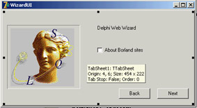
The program has also support for printing the current bitmap, after showing a page preview form in which the user can select the proper scaling. This extra portion of the program I built for earlier editions of the book is not discussed in detail, but I've left the code in the program so you can examine it. The User Interface of a WizardJust as you can use a TabControl without pages, you can also take the opposite approach and use a PageControl without tabs. Now I'll focus on the development of the user interface of a wizard. In a wizard, you direct the user through a sequence of steps, one screen at a time, and at each step you typically offer the choice of proceeding to the next step or going back to correct input entered in a previous step. Instead of tabs that can be selected in any order, wizards typically offer Next and Back buttons to navigate. This won't be a complex example; its purpose is just to give you a few guidelines. The example is called WizardUI. The starting point is to create a series of pages in a PageControl and set the TabVisible property of each TabSheet to False (while keeping the Visible property set to True). Since Delphi 5, you can also hide the tabs at design time. In this case, you'll need to use the shortcut menu of the page control, the Object Inspector's combo box, or the Object Tree View to move to another page, instead of the tabs. But why don't you want to see the tabs at design time? You can place controls on the pages and then place extra controls in front of the pages (as I've done in the example), without seeing their relative positions change at run time. You might also want to remove the useless captions from the tabs; they take up space in memory and in the resources of the application. In the first page, I've placed an image and a bevel control on one side and some text, a check box, and two buttons on the other side. Actually, the Next button is inside the page, and the Back button is over it (and is shared by all the pages). You can see this first page at design time in Figure 6.4. The following pages look similar, with a label, check boxes, and buttons on the right side and nothing on the left. When you click the Next button on the first page, the program looks at the status of the check box and decides which page is the following one. I could have written the code like this:
procedure TForm1.btnNext1Click(Sender: TObject);
begin
  BtnBack.Enabled := True;
  if CheckInprise.Checked then
    PageControl1.ActivePage := TabSheet2
  else
    PageControl1.ActivePage := TabSheet3;
  // move image and bevel
  Bevel1.Parent := PageControl1.ActivePage;
  Image1.Parent := PageControl1.ActivePage;
end;
After enabling the common Back button, the program changes the active page and finally moves the graphical portion to the new page. Because this code has to be repeated for each button, I've placed it in a method after adding a couple of extra features. This is the code:
procedure TForm1.btnNext1Click(Sender: TObject);
begin
  if CheckInprise.Checked then
    MoveTo (TabSheet2)
  else
    MoveTo (TabSheet3);
end;

procedure TForm1.MoveTo(TabSheet: TTabSheet);
begin
  // add the last page to the list
  BackPages.Add (PageControl1.ActivePage);
  BtnBack.Enabled := True;
  // change page
  PageControl1.ActivePage := TabSheet;
  // move image and bevel
  Bevel1.Parent := PageControl1.ActivePage;
  Image1.Parent := PageControl1.ActivePage;
end;
Besides the code I've already explained, the MoveTo method adds the last page (the one before the page change) to a list of visited pages, which behaves like a stack. The BackPages object of the TList class is created as the program starts, and the last page is always added to the end. When the user clicks the Back button, which is not dependent on the page, the program extracts the last page from the list, deletes its entry, and moves to that page: procedure TForm1.btnBackClick(Sender: TObject); var LastPage: TTabSheet; begin // get the last page and jump to it LastPage := TTabSheet (BackPages [BackPages.Count - 1]); PageControl1.ActivePage := LastPage; // delete the last page from the list BackPages.Delete (BackPages.Count - 1); // eventually disable the back button BtnBack.Enabled := not (BackPages.Count = 0); // move image and bevel Bevel1.Parent := PageControl1.ActivePage; Image1.Parent := PageControl1.ActivePage; end; With this code, the user can move back several pages until the list is empty, at which point you disable the Back button. You need to deal with a complication: While moving from a particular page, you know which pages are "next" and "previous," but you don't know which page you we came from, because there can be multiple paths to reach a page. Only by keeping track of the movements with a list can you reliably go back. The rest of the program code, which simply shows some website addresses, is very simple. The good news is that you can reuse the navigational structure of this example in your own programs and modify only the graphical portion and the content of the pages. Because most of the programs' labels show HTTP addresses, a user can click a label to open the default browser showing that page. You accomplish this by extracting the HTTP address from the label and calling the ShellExecute function:
procedure TForm1.LabelLinkClick(Sender: TObject);
var
  Caption, StrUrl: string;
begin
  Caption := (Sender as TLabel).Caption;
  StrUrl := Copy (Caption, Pos ('http://', Caption), 1000);
  ShellExecute (Handle, 'open', PChar (StrUrl), '', '', sw_Show);
end;
This method is hooked to the OnClick event of many labels on the form, which have been turned into links by setting the Cursor to a hand. This is one of the labels: object Label2: TLabel Cursor = crHandPoint Caption = 'Main site: http://www.borland.com' OnClick = LabelLinkClick end
|
|
|||||||||||||||||||||||||||||||||||||||||||||||||||||||||||||||||||||||||||||||||||||||||||||||||||||||||||||||||||||||||||||||||||||||||||||||||||||||||||||||||||||||||||||||||||||||||||||||||
|