|
|
|
Opening the Component ToolboxSo, you want to write a Delphi application. You open a new Delphi project and find yourself faced with a large number of components. The problem is that for every operation, there are multiple alternatives. For example, you can show a list of values using a list box, a combo box, a radio group, a string grid, a list view, or even a tree view if there is a hierarchical order. Which should you use? That's difficult to say. There are many considerations, depending on what you want your application to do. For this reason, I've provided a highly condensed summary of alternative options for a few common tasks.
The Text Input ComponentsAlthough a form or component can handle keyboard input directly using the OnKeyPress event, this isn't a common operation. Windows provides ready-to-use controls you can use to get string input and even build a simple text editor. Delphi has several slightly different components in this area. The Edit ComponentThe Edit component allows the user to enter a single line of text. You can also display a single line of text with a Label or a StaticText control, but these components are generally used only for fixed text or program-generated output, not for input. In CLX, there is also a native LCD digit control you can use to display numbers. The Edit component uses the Text property, whereas many other controls use the Caption property to refer to the text they display. The only condition you can impose on user input is the number of characters to accept. If you want to accept only specific characters, you can handle the OnKeyPress event of the edit box. For example, you can write a method that tests whether the character is a number or the Backspace key (which has a numerical value of 8). If it's not, you change the value of the key to the null character (#0), so that it won't be processed by the edit control and will produce a warning beep:
procedure TForm1.Edit1KeyPress(
  Sender: TObject; var Key: Char);
begin
  // check if the key is a number or backspace
  if not (Key in ['0'..'9', #8]) then
  begin
    Key := #0;
    Beep;
  end;
end;
The LabeledEdit ControlDelphi 6 added a nice control called LabeledEdit, which is an Edit control with a label attached to it. The Label appears as a property of the compound control, which inherits from TCustomEdit. This component is very handy, because it allows you to reduce the number of components on your forms, move them around more easily, and have a more consistent layout for all of the labels of an entire form or application. The EditLabel property is connected with the subcomponent, which has the usual properties and events. Two more properties, LabelPosition and LabelSpacing, allow you to configure the relative positions of the two controls.
The MaskEdit ComponentTo customize the input of an edit box further, you can use the MaskEdit component. It has an EditMask property, which is a string indicating for each character whether it should be uppercase, lowercase, or a number, and other similar conditions. You can see the editor for the EditMask property here: 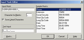
The Input Mask Editor allows you to enter a mask, but it also asks you to indicate a character to be used as a placeholder for the input and to decide whether to save the literals present in the mask, together with the final string. For example, you can choose to display the parentheses around the area code of a phone number only as an input hint or to save them with the string holding the resulting number. These two entries in the Input Mask Editor correspond to the last two fields of the mask (separated by semicolons).
The Memo and RichEdit ComponentsThe controls discussed so far allow a single line of input. The Memo component, by contrast, can host several lines of text but (on the Win95/98 platforms) still retains the 16-bit Windows text limit (32 KB) and allows only a single font for the entire text. You can work on the text of the memo line by line (using the Lines string list) or access the entire text at once (using the Text property). If you want to host a large amount of text or change fonts and paragraph alignments, in VCL you should use the RichEdit control, a Win32 common control based on the RTF document format. You can find an example of a complete editor based on the RichEdit component among the sample programs that ship with Delphi. (The example is named RichEdit, too.)
The RichEdit component has a DefAttributes property indicating the default styles and a SelAttributes property indicating the style of the current selection. These two properties are not of the TFont type, but they are compatible with fonts, so you can use the Assign method to copy the value, as in the following code fragment:
procedure TForm1.Button1Click(Sender: TObject);
begin
  if RichEdit1.SelLength > 0 then
  begin
    FontDialog1.Font.Assign (RichEdit1.DefAttributes);
    if FontDialog1.Execute then
      RichEdit1.SelAttributes.Assign (FontDialog1.Font);
  end;
end;
The TextViewer CLX ControlCLX and Qt lack a RichEdit control, but on the other hand they provide a full-blown HTML viewer, which is powerful for displaying formatted text but not for typing it. This HTML viewer is embedded in two controls: the single-page TextViewer control and the TextBrowser control with active links. As a simple demo, I've added a memo and a text viewer to a CLX form and connected them so that everything you type on the memo is immediately displayed in the viewer. I've called the example HtmlEdit not because this is a real HTML editor, but because this is the simplest way I know to build an HTML preview inside a program. The program's form is shown at run time in Figure 5.3. 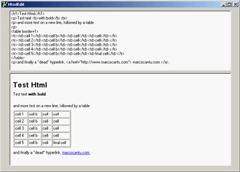
Figure 5.3: The HtmlEdit example at run time: When you add new HTML text to the memo, you get an immediate preview.
Selecting OptionsTwo standard Windows controls allow the user to choose different options. Two other controls let you group sets of options. The CheckBox and RadioButton ComponentsThe first standard option-selecting control is the check box, which corresponds to an option that can be selected regardless of the status of other check boxes. Setting the AllowGrayed property of the check box allows you to display three different states (selected, not selected, and grayed), which alternate as a user clicks the check box. The second type of control is the radio button, which corresponds to an exclusive selection. Two radio buttons on the same form or inside the same radio group container cannot be selected at the same time, and one of them should always be selected (as programmer, you are responsible for selecting one of the radio buttons at design time). The GroupBox ComponentsTo host several groups of radio buttons, you can use a GroupBox control to hold them together, both functionally and visually. To build a group box with radio buttons, simply place the GroupBox component on a form and then add the radio buttons to the group box, as in the following example: 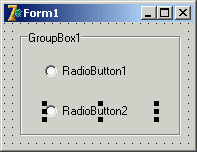 You can handle the radio buttons individually, but it's easier to navigate through the array of controls owned by the group box, as discussed in Chapter 4. Here is a small code excerpt used to get the text of a group's selected radio button:
var
  I: Integer;
  Text: string;
begin
  for I := 0 to GroupBox1.ControlCount - 1 do
    if (GroupBox1.Controls[I] as TRadioButton).Checked then
      Text := TRadioButton(GroupBox1.Controls[I]).Caption;
The RadioGroup ComponentDelphi has a similar component that can be used specifically for radio buttons: the RadioGroup component. A RadioGroup is a group box with some radio buttons inside it. The difference is that these internal radio buttons are managed automatically by the container control. Using a radio group is generally easier than using a group box, because the various items are part of a list, as in a list box. This is how you can get the text of the selected item: Text := RadioGroup1.Items [RadioGroup1.ItemIndex]; Another advantage is that the RadioGroup component can automatically align its radio buttons in one or more columns (as indicated by the Columns property), and you can easily add new choices at run time by adding strings to the Items string list. By contrast, adding new radio buttons to a group box is quite complex. ListsWhen you have many selections, radio buttons are not appropriate. The usual number of radio buttons is no more than five or six, to avoid cluttering the user interface; when you have more choices, you can use a list box or one of the other controls that display lists of items and allow the user to select one of them. The ListBox ComponentThe selection of an item in a list box uses the Items and ItemIndex properties as in the earlier code shown for the RadioGroup control. If you need access to the text of selected list box items often, you can write a small wrapper function like this:
function SelText (List: TListBox): string;
var
  nItem: Integer;
begin
  nItem := List.ItemIndex;
  if nItem >= 0 then
    Result := List.Items [nItem]
  else
    Result := '';
end;
Another important feature is that by using the ListBox component, you can choose between allowing only a single selection, as in a group of radio buttons, and allowing multiple selections, as in a group of check boxes. You make this choice by specifying the value of the MultiSelect property. There are two kinds of multiple selections in Windows and in Delphi list boxes: multiple selection and extended selection. In the first case, a user selects multiple items simply by clicking them; in the second case, the user can use the Shift and Ctrl keys to select multiple consecutive or nonconsecutive items, respectively. The two alternatives are determined by the status of the ExtendedSelect property. For a multiple-selection list box, a program can retrieve information about the number of selected items by using the SelCount property, and it can determine which items are selected by examining the Selected array. This array of Boolean values has the same number of entries as the list box. For example, to concatenate all the selected items into a string, you can scan the Selected array as follows:
var
  SelItems: string;
  nItem: Integer;
begin
  SelItems := '';
  for nItem := 0 to ListBox1.Items.Count - 1 do
    if ListBox1.Selected [nItem] then
      SelItems := SelItems + ListBox1.Items[nItem] + ' ';
Differently from VCL, in CLX you can configure a ListBox to use a fixed number of columns and rows, using the Columns, Row, ColumnLayout, and RowLayout properties. Of these, the VCL ListBox has only the Columns property. The ComboBox ComponentList boxes take up a lot of screen space, and they offer a fixed selection—that is, a user can choose only among the items in the list box and cannot enter any choice the programmer did not specifically foresee. You can solve both problems by using a ComboBox control, which combines an edit box and a drop-down list. The behavior of a ComboBox component changes a lot depending on the value of its Style property:
Note also that accessing the text of the selected value of a ComboBox is easier than doing the same operation for a list box, because you can simply use the Text property. A useful and common trick for combo boxes is to add a new element to the list when a user enters some text and presses the Enter key. The following method first tests whether the user has pressed that key, by looking for the character with the numeric (ASCII) value of 13. It then tests to make sure the text of the combo box is not empty and is not already in the list (if its position in the list is less than zero). Here is the code:
procedure TForm1.ComboBox1KeyPress(
  Sender: TObject; var Key: Char);
begin
  // if the user presses the Enter key
  if Key = Chr (13) then
    with Sender as TComboBox do
      if (Text <> '') and (Items.IndexOf (Text) < 0) then
        Items.Add (Text);
end;
Since version 6, Delphi includes two new events for the combo box. The OnCloseUp event corresponds to the closing of the drop-down list and complements the preexisting OnDropDown event. The OnSelect event fires only when the user selects something in the drop-down list, as opposed to typing in the edit portion. Another nice feature is the AutoComplete property. When it is set, the ComboBox component (and the ListBox, as well) automatically locates the string nearest to the one the user is entering, suggesting the final part of the text. The core of this feature, also available in CLX, is implemented in the TCustomListBox.KeyPress method. The CheckListBox ComponentAnother extension of the list box control is represented by the CheckListBox component, a list box with each item preceded by a check box:  A user can select a single item in the list, but can also click the check boxes to toggle their status. This makes the CheckListBox a very good component for multiple selections or for highlighting the status of a series of independent items (as in a series of check boxes). To check the current status of each item, you can use the Checked and State array properties (use the latter if the check boxes can be grayed). Delphi 5 introduced the ItemEnabled array property, which you can use to enable or disable each item of the list. You'll use the CheckListBox in the DragList example, later in this chapter.
The Extended Combo Boxes: ComboBoxEx and ColorBoxThe ComboBoxEx (where ex stands for extended) is the wrapper of a new Win32 common control that extends the traditional combo box by allowing images to appear next to the items in the list. You attach an image list to the combo box, and then select an image index for each item to display. The effect of this change is that the simple Items string list is replaced by a more complex collection, the ItemsEx property. I'll use the ComboBoxEx control in the RefList2 example in Chapter 7, "Working with Forms."
The ColorBox control is a version of the combo box specifically aimed at selecting colors. You can use its Style property to choose which groups of colors you want to see in the list (standard color, extended colors, system colors, and so on). The ListView and TreeView ComponentsIf you want an even more sophisticated list, you can use the ListView common control, which will make the user interface of your application look very modern. This component is slightly more complex to use, as described in the section "ListView and TreeView Controls" later in this chapter. Other alternatives for listing values are the TreeView common control, which shows items in a hierarchical output, and the StringGrid control, which shows multiple elements for each line. For an actual example of the use of this component, refer to the free online chapter "Graphics in Delphi" discussed in Appendix C. If you use the common controls in your application, users will already know how to interact with them, and they will regard the user interface of your program as up to date. TreeView and ListView are the two key components of Windows Explorer, and you can assume that many users will be familiar with them—even more so than with the traditional Windows controls. CLX adds also an IconView control, which parallels some features of the VCL ListView.
The ValueListEditor ComponentDelphi applications often use the name/value structure natively offered by string lists, which I discussed in Chapter 4. Delphi 6 introduced a version of the StringGrid (technically a TCustomDrawGrid descendant class) component specifically geared toward this type of string lists. The ValueList-Editor has two columns in which you can display and let the user edit the contents of a string list with name/value pairs, as you can see in Figure 5.4. This string list is indicated in the Strings property of the control. 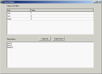
Figure 5.4: The NameValues example uses the ValueListEditor component, which shows the name/value or key/ value pairs of a string list, also visible in a plain memo. The power of this control lies in the fact that you can customize the editing options for each position of the grid or for each key value, using the run-time-only ItemProps array property. For each item, you can indicate:
Needless to say, this behavior resembles what is available generally for string grids and the DBGrid control, and also the behavior of the Object Inspector. The ItemProps property must be set up at run time, by creating an object of the TItemProp class and assigning it to an index or a key of the string list. To have a default editor for each line, you can assign the same item property object multiple times. In the example, this shared editor sets an edit mask for up to three numbers:
procedure TForm1.FormCreate(Sender: TObject);
var
  I: Integer;
begin
  SharedItemProp := TItemProp.Create (ValueListEditor1);
  SharedItemProp.EditMask := '999;0; ';
  SharedItemProp.EditStyle := esEllipsis;

  FirstItemProp := TItemProp.Create (ValueListEditor1);
  for I := 1 to 10 do
    FirstItemProp.PickList.Add(IntToStr (I));

  Memo1.Lines := ValueListEditor1.Strings;
  ValueListEditor1.ItemProps [0] := FirstItemProp;
  for I := 1 to ValueListEditor1.Strings.Count - 1 do
    ValueListEditor1.ItemProps [I] := SharedItemProp;
end;
You must repeat similar code in case the number of lines changes—for example, by adding new elements in the memo and copying them to the value list.
procedure TForm1.ValueListEditor1StringsChange(Sender: TObject);
var
  I: Integer;
begin
  ValueListEditor1.ItemProps [0] := FirstItemProp;
  for I := 1 to ValueListEditor1.Strings.Count - 1 do
    if not Assigned (ValueListEditor1.ItemProps [I]) then
      ValueListEditor1.ItemProps [I] := SharedItemProp;
end;
Another property, KeyOptions, allows you to let the user edit the keys (the names), add new entries, delete existing entries, and allow for duplicated names in the first portion of the string. Oddly enough, you cannot add new keys unless you also activate the edit options, which makes it hard to let the user add extra entries while preserving the names of the basic entries. RangesFinally, you can use a few components to select values in a range. Ranges can be used for numeric input and for selecting an element in a list. The ScrollBar ComponentThe stand-alone ScrollBar control is the original component of this group, but it is seldom used by itself. Scroll bars are usually associated with other components, such as list boxes and memo fields, or are associated directly with forms. In all these cases, the scroll bar can be considered part of the surface of the other components. For example, a form with a scroll bar is actually a form that has an area resembling a scroll bar painted on its border, a feature governed by a specific Windows style of the form window. By resembling, I mean that it is not technically a separate window of the ScrollBar component type. These "fake" scroll bars are usually controlled in Delphi using two specific properties of the form and the other components hosting them: VertScrollBar and HorzScrollBar. The TrackBar and ProgressBar ComponentsDirect use of the ScrollBar component is quite rare, especially with the TrackBar component introduced with Windows 95, which is used to let a user select a value in a range. Among Win32 common controls is the companion ProgressBar control, which allows the program to output a value in a range, showing the progress of a lengthy operation. These two components are visible here: 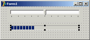 The UpDown ComponentAnother related control is the UpDown component, which is usually connected to an edit box so that the user can either type a number in it or increase and decrease the number using the two small arrow buttons. To connect the two controls, you set the Associate property of the UpDown component. Nothing prevents you from using the UpDown component as a stand-alone control, displaying the current value in a label or in some other way.
The PageScroller ComponentThe Win32 PageScroller control is a container allowing you to scroll the internal control. For example, if you place a toolbar in the page scroller and the toolbar is larger than the available area, the PageScroller will display two small arrows on the side. Clicking these arrows will scroll the internal area. This component can be used as a scroll bar, but it also partially replaces the ScrollBox control. The ScrollBox ComponentThe ScrollBox control represents a region of a form that can scroll independently from the rest of the surface. For this reason, the ScrollBox has two scroll bars used to move the embedded components. You can easily place other components inside a ScrollBox, as you do with a panel. In fact, a ScrollBox is basically a panel with scroll bars to move its internal surface, an interface element used in many Windows applications. When you have a form with many controls and a toolbar or status bar, you might use a ScrollBox to cover the central area of the form, leaving its toolbars and status bars outside of the scrolling region. By relying on the scroll bars of the form, you might allow the user to move the toolbar or status bar out of view (a very odd situation). CommandsThe final category of components is not as clear-cut as the previous ones, and relates to commands. The basic component of this group is the TButton (or push button, in Windows jargon). More than stand-alone buttons, Delphi programmers use buttons (or TToolButton objects) within toolbars (in the early ages of Delphi, they used speed buttons within panels). Beside buttons and similar controls, the other key technique for issuing commands is the use of menu items, part of the pull-down menus attached to forms' main menus or local pop-up menus activated with the right mouse button. Menu- or toolbar-related commands fall into different categories depending on their purpose and the feedback their interface provides to the user:
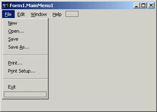
Commands and ActionsAs you'll see in Chapter 6, modern Delphi applications tend to use the ActionList component or its ActionManager extension to handle menu and toolbar commands. In short, you define a series of action objects and associate each of them to a toolbar button and/or a menu item. You can define the command execution in a single place but also update the user interface simply by targeting the action; the related visual control will automatically reflect the status of the action object. The Menu DesignerIf you just need to show a simple menu in your application, you can place a MainMenu or PopupMenu component on a form and double-click on it to fire up the Menu Designer, shown in Figure 5.5. You add new menu items and provide them with a Caption property, using a hyphen (-) to separate caption menu items. Delphi creates new components for each menu item you add. To name each component, Delphi uses the caption you enter and appends a number (so that Open becomes Open1). After removing spaces and other special characters from the caption, if nothing is left Delphi adds the letter N to the name. Finally it appends the number. Thus menu item separators are called N1, N2, and so on. Knowing what Delphi tends to do by default, you should think of editing the name first, which is necessary if you want to end up with a sensible component naming scheme.
To obtain a more modern-looking menu, you can add an image list control to the program, hosting a series of bitmaps, and connect the image list to the menu using its Images property. You can then set an image for each menu item by setting the proper value of its ImageIndex property. The definition of images for menus is quite flexible—you can associate an image list with any specific pull-down menu (and even a specific menu item) using the SubMenuImages property. Having a specific smaller image list for each pull-down menu instead of a single large image list for the entire menu allows for more run-time customization of an application.
Pop-Up Menus and the OnContextPopup EventThe PopupMenu component is typically displayed when the user right-clicks a component that uses the given pop-up menu as the value for its PopupMenu property. However, besides connecting the pop-up menu to a component with the corresponding property, you can call its Popup method, which requires the position of the pop-up in screen coordinates. The proper values can be obtained by converting a local point to a screen point with the ClientToScreen method of the local component, which is a label in this code fragment:
procedure TForm1.Label3MouseDown(Sender: TObject;
  Button: TMouseButton; Shift: TShiftState; X, Y: Integer);
var
  ScreenPoint: TPoint;
begin
  // if some condition applies...
  if Button = mbRight then
  begin
    ScreenPoint := Label3.ClientToScreen (Point (X, Y));
    PopupMenu1.Popup (ScreenPoint.X, ScreenPoint.Y)
  end;
end;
An alternative approach is to use the OnContextMenu event. This event, introduced in Delphi 5, fires when a user right-clicks a component—exactly what I traced previously with the test if Button = mbRight. The advantage is that the same event is also fired in response to a Shift+F10 key combination, as well as the shortcut-menu key of some keyboards. You can use this event to fire a pop-up menu with little code: procedure TFormPopup.Label1ContextPopup(Sender: TObject; MousePos: TPoint; var Handled: Boolean); var ScreenPoint: TPoint; begin // add dynamic items PopupMenu2.Items.Add (NewLine); PopupMenu2.Items.Add (NewItem (TimeToStr (Now), 0, False, True, nil, 0, '')); // show popup ScreenPoint := ClientToScreen (MousePos); PopupMenu2.Popup (ScreenPoint.X, ScreenPoint.Y); Handled := True; // remove dynamic items PopupMenu2.Items [4].Free; PopupMenu2.Items [3].Free; end; This example adds some dynamic behavior to the shortcut menu, adding a temporary item indicating when the pop-up menu is displayed. This result is not particularly useful, but it illustrates that if you need to display a plain pop-up menu, you can easily use the PopupMenu property of the control in question or one of its parent controls. Handling the OnContextMenu event makes sense only when you want to do some extra processing. The Handled parameter is preinitialized to False, so that if you do nothing in the event handler, the normal pop-up menu processing will occur. If you do something in your event handler to replace the normal pop-up menu processing (such as popping up a dialog or a customized menu, as in this case), you should set Handled to True and the system will stop processing the message. You'll rarely set Handled to True, because you'll generally handle the OnContextPopup to dynamically create or customize the pop-up menu, but then you can let the default handler show the menu. The handler of an OnContextPopup event isn't limited to displaying a pop-up menu. It can perform any other operation, such as directly display a dialog box. Here is an example of a right-click operation used to change the color of the control:
procedure TFormPopup.Label2ContextPopup(Sender: TObject;
  MousePos: TPoint; var Handled: Boolean);
begin
  ColorDialog1.Color := Label2.Color;
  if ColorDialog1.Execute then
    Label2.Color := ColorDialog1.Color;
  Handled := True;
end;
All the code snippets from this section are available in the simple CustPop example for VCL and QCustPop for CLX.
|
|
|||||||||||||||||||||||||||||||||||||||||||||||||||||||||||||||||||||||||||||||||||||||||||||||||||||||||||||||||||||||||||||||||||||||||||||||||||||||||||||||||||||||||||||||||||||||||||||||||||||||||||||||||||||||||||||||
|